Primary color
#1B96FF
#D9D9D9
#EEEEEE
#FFFFFF
#032D60
Corner Radius
Drop Shadow
Font - Salesforce Sans
Abstraction Height
If 8px, then corner radius- 2px
If 4px, then corner radius- 1px
Outer frame - 16px
Inner frame - 8px
Outer frame-
X= 0
Y= 12
Blur- 30
#000000 - 15%
Inner frame-
X= 0
Y= 0
Blur- 12
#000000 - 8%
Line Height - Auto
Letter Spacing (Kerning) - 0%
CTA’s
Start free trail
Watch demo
Watch demo
Start free trail
Default State
Hover State
720*720
540*540
Overview
Strategizing webpage layouts to showcase products and service provided by Salesforce.
DELIVERABLE
Website UI Design
TIMELINE
84 Days
TOOL
Figma
SALESFORCE: WEBSITE
RE-DESIGN (TEAM PROJECT)
LIVE WEBSITE
They knew that revamping their digital platform would require the same rigor it takes to deliver the cutting edge solutions they build for their clients.
As a UX/UI Design Intern at Webenza, I worked on building
the same.
Approach
To address the complexity challenges of the website, we spent several days developing 'Sticker sheet (Design guidelines)', the layout design for the Product pages, Solution Pages & Overview pages and the interactions across the website to ensure it would meet the audience’s needs and make it intuitive and enjoyable to discover and engage with the diverse content.
Role
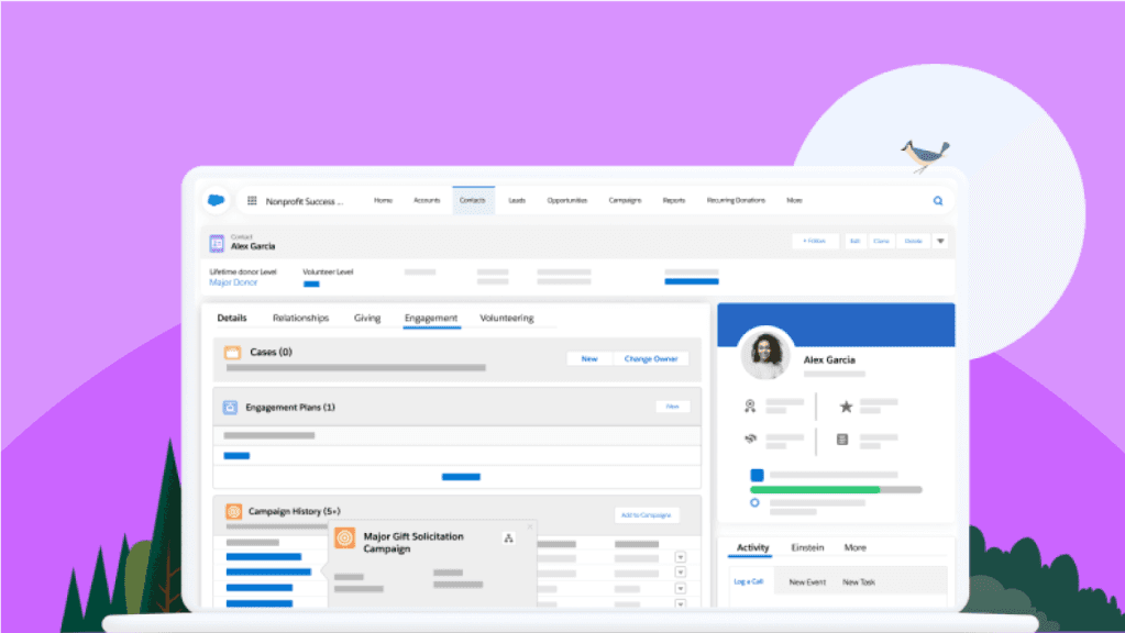
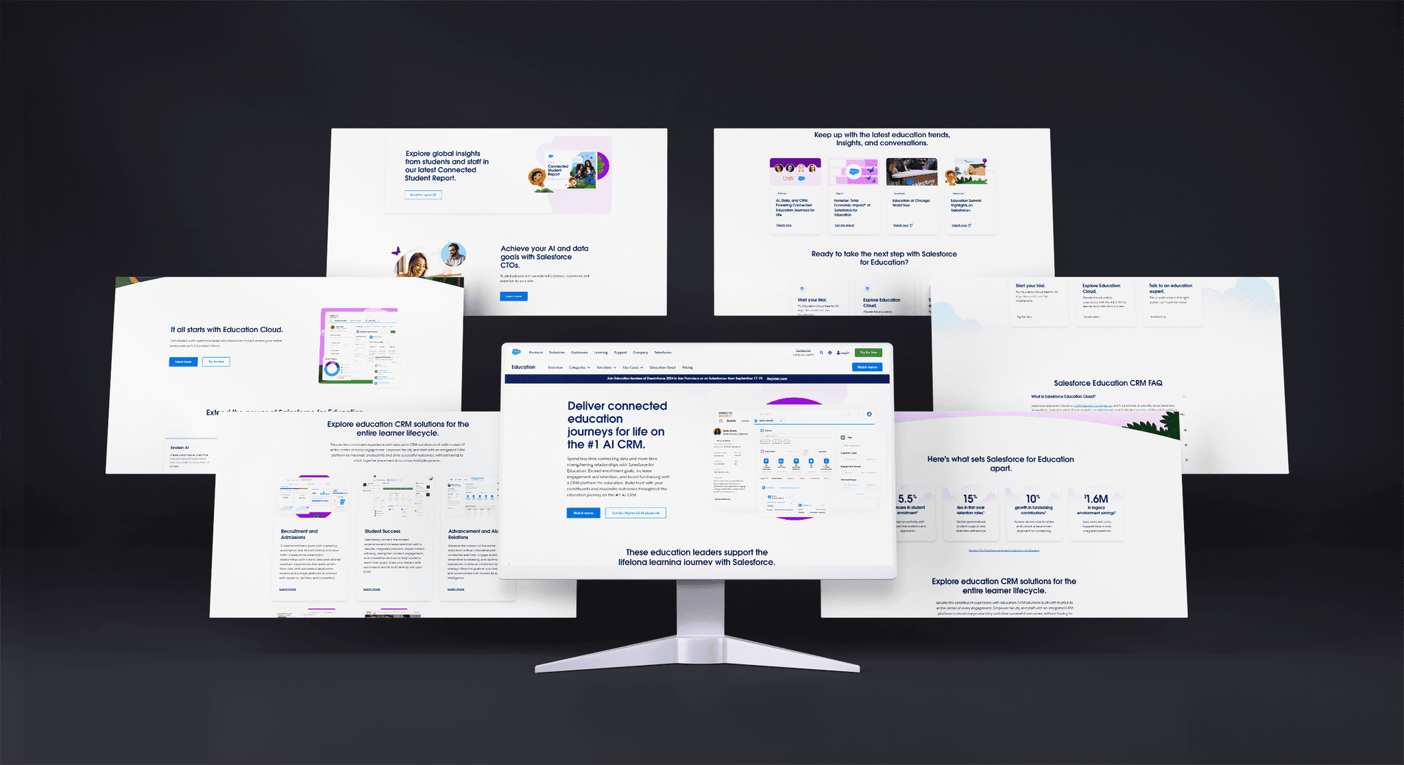
Fig 4 : Education Industry Overview Page
As a UI Designer, I played a crucial role in shaping the Salesforce's website user interface. My responsibilities included:
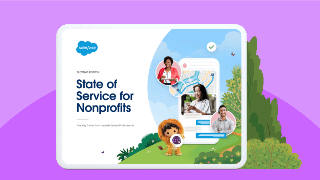
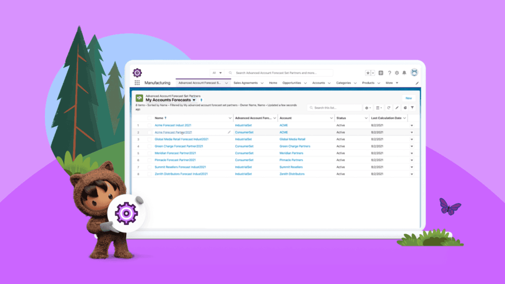
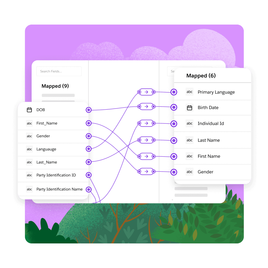
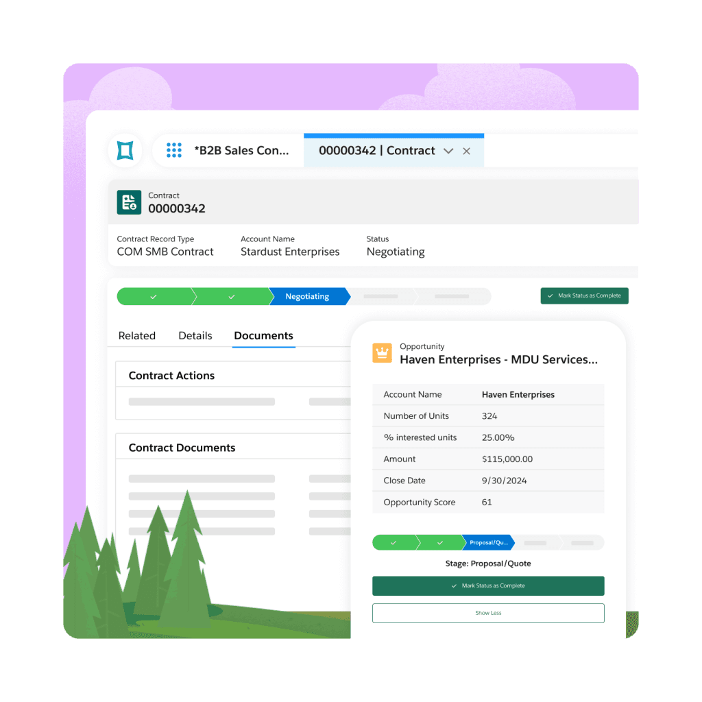
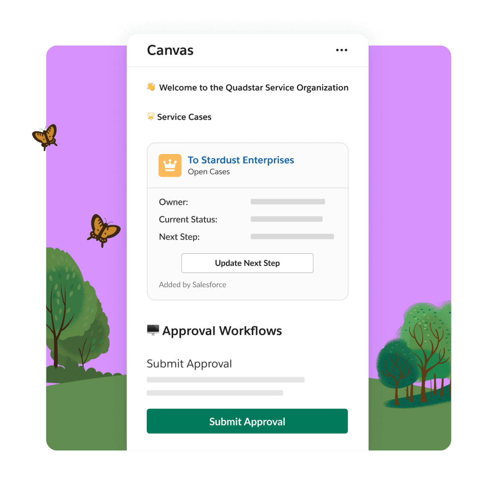
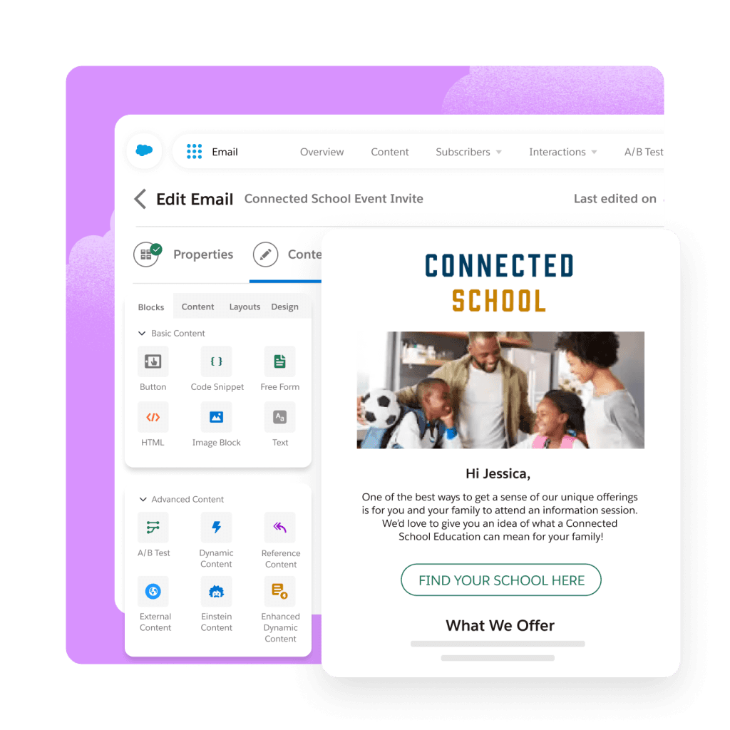
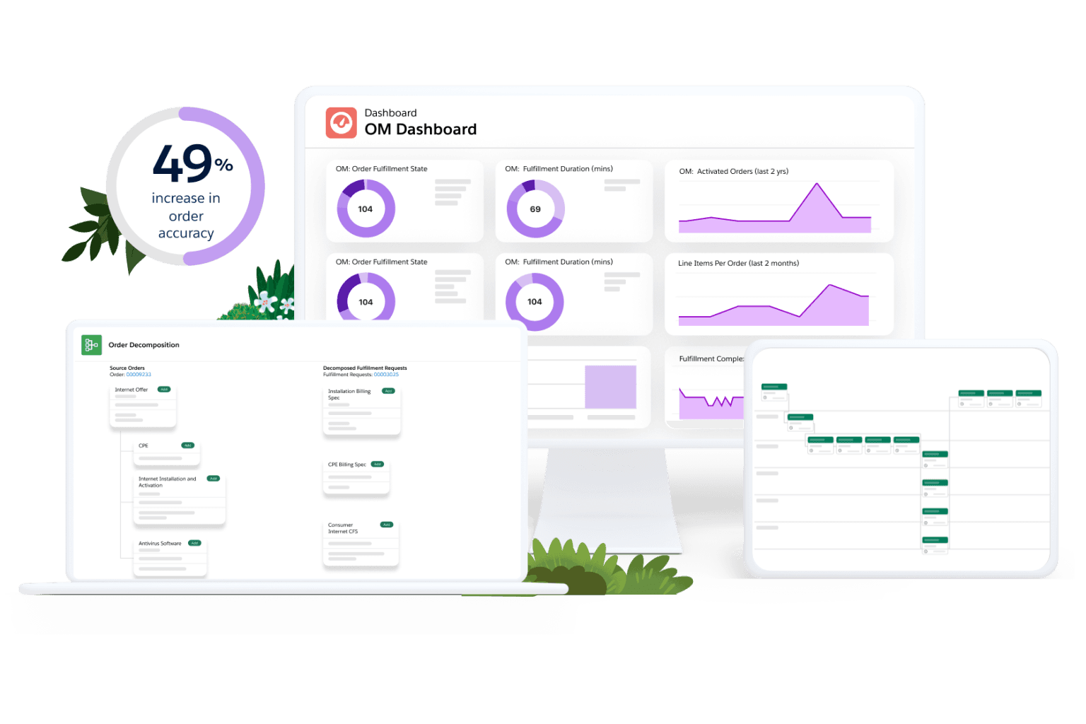
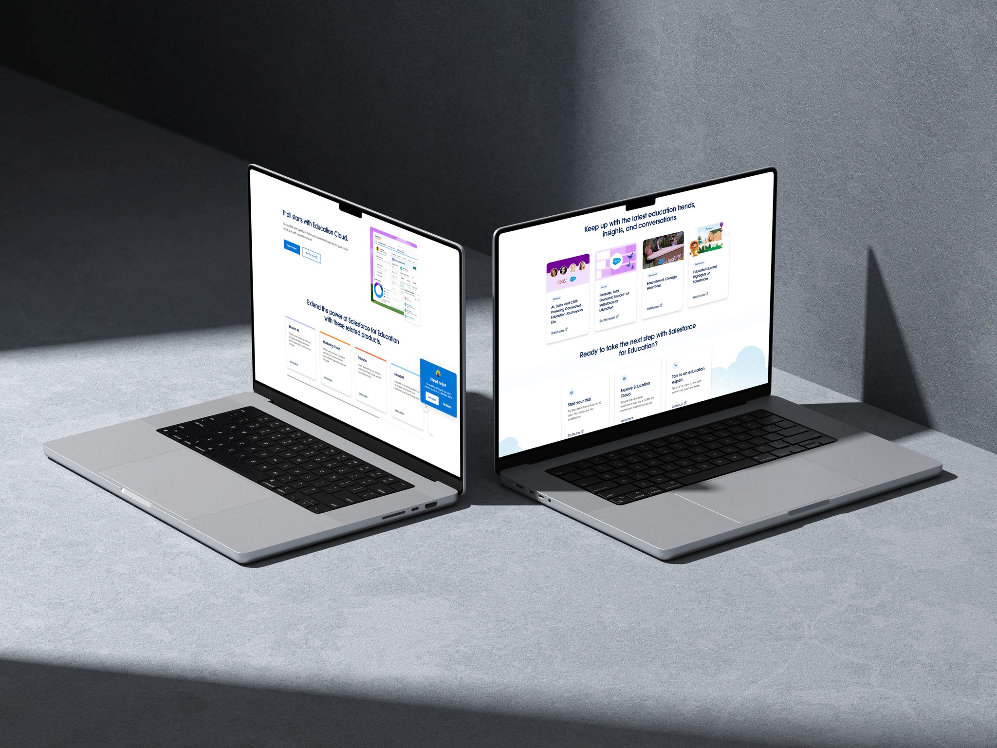
Fig 1, 2, 3 : Design System Preview
Key design decision
Intuitive Navigation: We designed a clear and structured navigation system that allowed users to easily find the feature/section they needed.
Visual Hierarchy: We used hierarchy to guide users attention to important information. By using larger typography for headings, bold the important texts and colour to differentiate between sections.
Accessibility: We prioritized it by ensuring that the website was compatible with screen readers & keyboard navigation.
Results
Despite being a long 3 months project, the website was tested and delivered on schedule and received excellent feedbacks from the salesforce US team.
Key learnings
The values of adopting a user centred design approach to understand user needs and design.
The significance of maintaining the consistency throughout the UI to create a cohesive and intuitive experience.
Credits
Rahul Ganesh - UX/ Design Director
Rajesh - Senior UI Designer
Gopi - UI Designer
Saurabh Mahaldar - UX/UI Designer
Steven Gomes - Junior UX/UI Designer
Ashwathy R. - Junior UX/UI Designer
Aayush Kriti - UX/UI Design Intern
Shruti Khandelwal - UX/UI Design Intern
Lehar - UX/UI Design Intern
In collab with Developers & Content team.
Designed with
by Aayush Kriti
in 2024. All Rights Reserved
Back to top
